Description
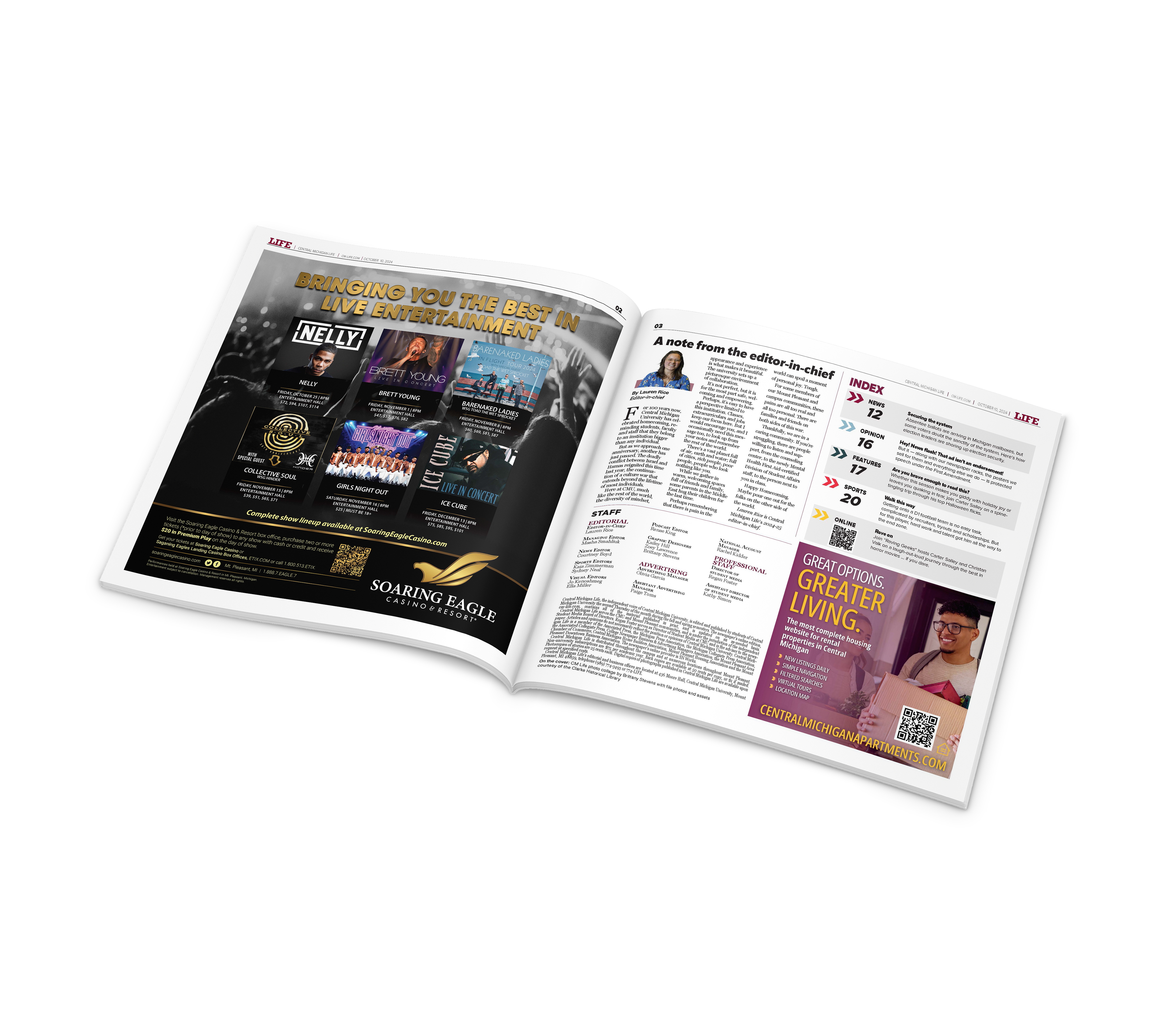
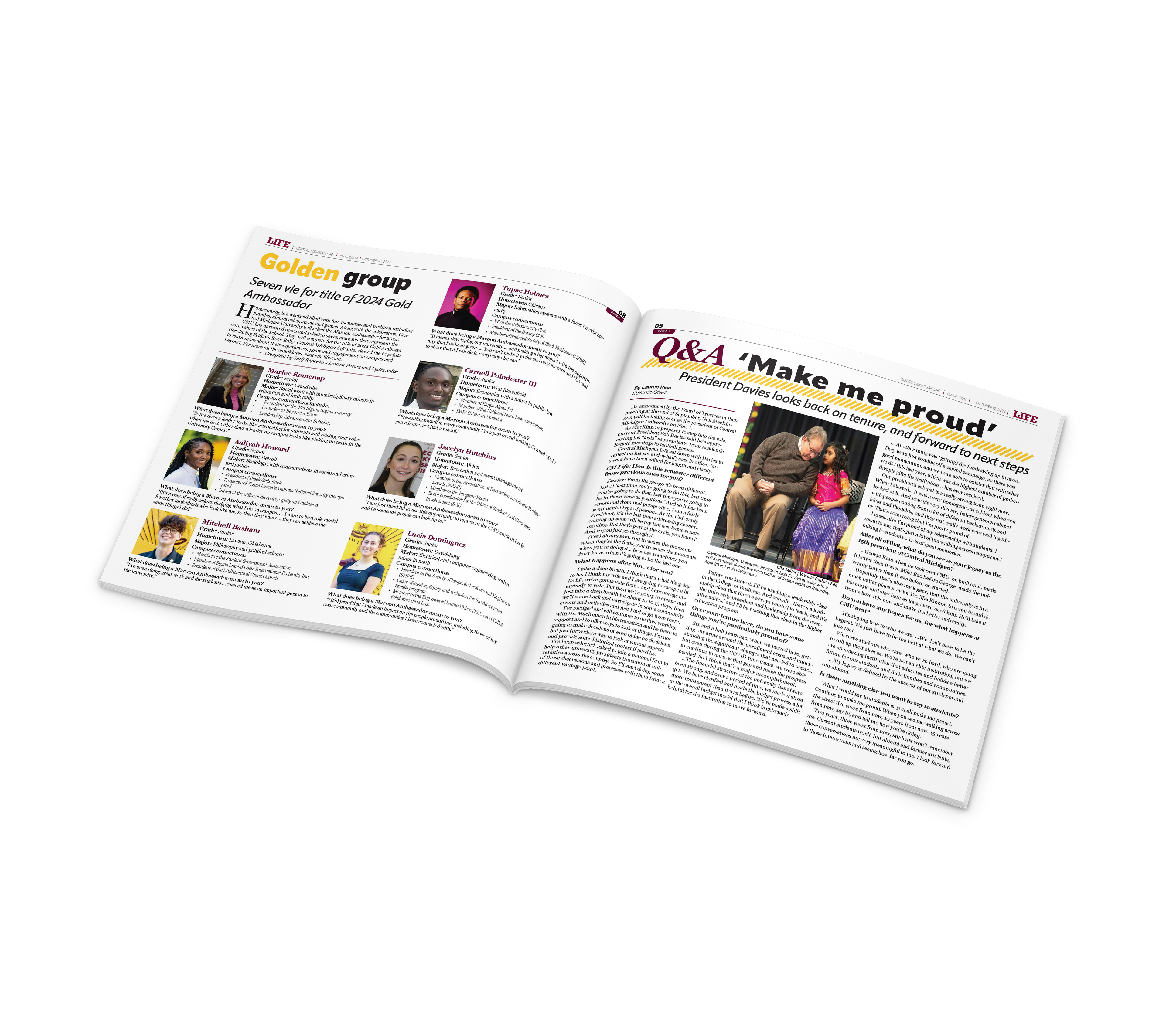
This was the first time print where I was the “Design Team Lead”, and I wanted to make meaningful yet thoughtful changes to the design of the newspaper. This was a collaborative effort to redesign the paper, as it included the input of myself, the design team, the editor-in-chief, as well as the Director of Student Media. The goal of the redesign was to create a publication that felt more like a news magazine that was clean in design making it easier to read as well as focus on the articles versus the bulky design assets.
The digital archive of this paper can be found here.
Contributors
Brittany Stevens: Design Team Lead, Page Designer, Cover Designer, Photo Illustrator
Lauren Rice: 2024-2025 Editor-in-Chief, Writer
Regan Foster: Director of Student Media
CM LIFE Journalists & Editors: Writing of articles, Editing of columns, Editing of page design, Photography and Acquiring Photos
CM LIFE/Gold Media Group Design Team: Page Designers, Info-graphic Creation, Advertising Design
Changes Implemented
Color Coding & Folio Changes
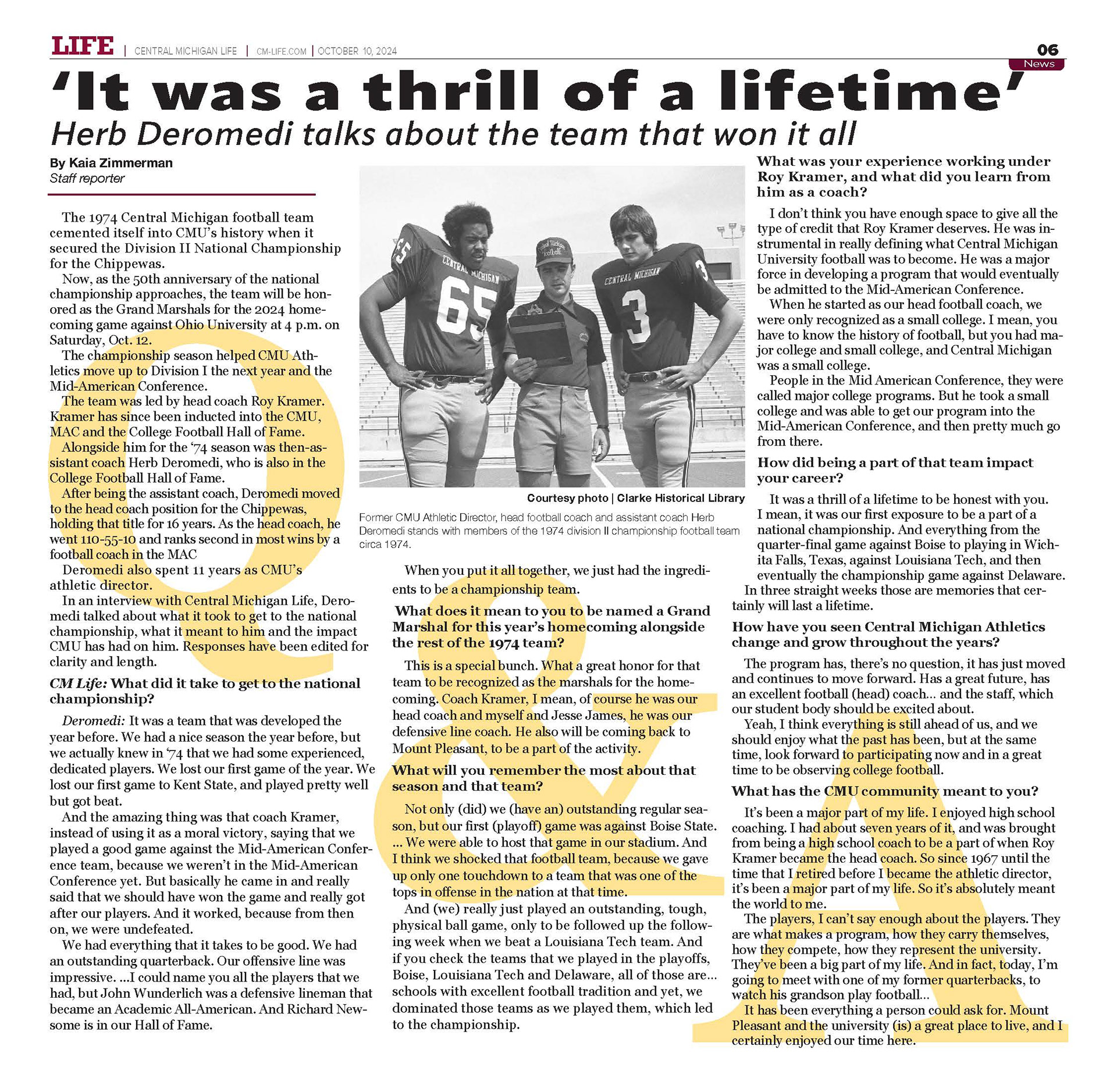
A color coding system was used t o differentiate between the different sections of the newspaper. These colors would be used in the index chevrons, the flags in the folios, and the header of the new section head bracket. The introduction of folio flags to indicate the section of the newspaper was also a new addition with this issue.
The colors that we used are those that are part of CM LIFE’s and CMU’s main and secondary color schemes so that they are on brand.
Layout Changes
To give the paper a cleaner designed look, assets that were previously separate graphics, like the podcast plug at the end of the featured story, and even headlines were integrated into the design. This gives the page a much more unified look, and the reader can focus on the story.
Additional photos of sections within the issue that I was responsible for:


